Documentation Index
Fetch the complete documentation index at: https://rive-accessibility.mintlify.app/llms.txt
Use this file to discover all available pages before exploring further.
Semantics is currently only available in Early Access. Runtime support is in development or released as experimental.
- Role — what the node is (button, checkbox, tab, etc.)
- Properties — additional information like label, value, or hint
- Traits — what the node can do (expandable, selectable, checkable, etc.)
- State — what the node is doing (expanded, selected, checked, etc.)
- Actions - interactions triggered by the user (tap, increase, decrease)
Semantics at RuntimeAt runtime, semantics are converted into the platform’s accessibility system.On web, this creates accessible DOM elements (for example, divs with roles and attributes). On iOS and Android, a semantic tree is generated and exposed to the system’s accessibility APIs.Rive handles mapping your semantics to each platform automatically.
Adding Semantics
Add Semantics
Select an element in your scene. In the right sidebar, click the
+ button in the Semantics panel to enable semantics for that element.Choose a Role
Use the dropdown to assign a semantic role, such as button, image, or heading.
Configure Properties
Update the element’s semantic properties, such as label, value, or hint.
Semantic Role
The semantic role defines what the element is (for example, a button or image). Screen readers use this to describe the element and determine how it should behave. Each role has different available properties. If your element doesn’t match a specific role, you can leave it set to None.Some elements, like text inputs, automatically infer their semantic role.
Semantic Properties
Semantic properties provide additional information about an element, such as its label, value, or hint. Available properties vary depending on the selected semantic role.Label
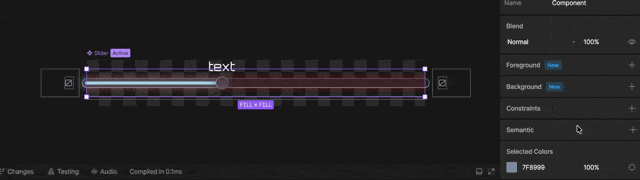
The label describes what the element is or does. This is what screen readers announce. For example, a slider that controls volume might have the label:Volume
Text elements automatically use their text content as the label.
Heading (Text only)
Text elements can be marked as headings to define structure and hierarchy. Options include None and Heading 1 through Heading 6. Headings help screen reader users navigate your content more easily.On web, Heading 1 maps to an
<h1> element, Heading 2 to <h2>, and so on.Value (Inputs only)
Some elements, like sliders and switches, have a Value property that reflects their current state. For example, a volume slider might have a value of70%.
Use data binding to keep the semantic value in sync with the visual state.
Traits
Traits define what an element can do, while states describe what it is doing right now. Some semantic roles include traits, such as expandable or selectable. Enabling a trait makes its corresponding state available. The lock icon indicates a required trait for that semantic role. For example, a checkbox always includes the selectable trait.State
States represent the current value of the node. For example, an element with the selectable trait will have a selected state. Some state flags are only meaningful when their corresponding trait is set. Without the trait, the platform sees the property as not applicable. Keep semantic states in sync with your Rive file. For example, bind a boolean from your view model to the toggled state of a switch. You could also key the toggled state in a timeline.Hidden
Hides the element from the accessibility tree.Disabled
Marks the element as disabled and not interactive.Live Region
Indicates that the element’s content may update dynamically and should be announced by screen readers.Actions
Semantic actions are interaction events triggered by assistive technologies. You can listen for these actions and update your experience in response.Adding an Action
Create a Listener
Select your object and create a new Listener.
Listen to a Semantic Action
With your listener selected, in the right sidebar choose Semantic Action in the Listen to dropdown.
Set the action type
Select the action type to listen for.
Types of Actions
Actions include tap, increase, and decrease.Tap
Represents activating an element (similar to a click). In most cases, tap is handled automatically by the platform and triggers standard pointer events. For example, activating a button with a screen reader behaves the same as a click, whether or not a tap listener is present. You typically only need a tap listener when implementing custom interactions.Increase / Decrease
Used for adjustable elements like sliders. Users trigger these actions through assistive technologies—for example, by focusing a slider and swiping up or down with a screen reader, or using arrow keys on a keyboard. Unlike tap, these actions are not handled automatically. You should listen for increase and decrease and update your value accordingly.Testing Semantics
Adding semantics is only the first step. You should always test your experience at runtime to make sure it behaves as expected. Small issues—like a missing label or incorrect state—can make elements confusing or unusable for screen reader users.Runtime Testing
The best way to test semantics is by using a screen reader.- macOS / iOS: VoiceOver
- Android: TalkBack
- Windows: Narrator or NVDA
- Move between elements
- Listen to how each element is announced
- Interact with buttons, sliders, and inputs
What to Check
As you test, pay attention to:- Labels — Does each element clearly describe what it is or does?
- Role — Is the correct role announced (button, heading, etc.)?
- Value — Do dynamic elements (like sliders) report the correct value?
- State — Are states like selected, disabled, or expanded accurate?
- Order — Does navigation follow a logical flow?